1 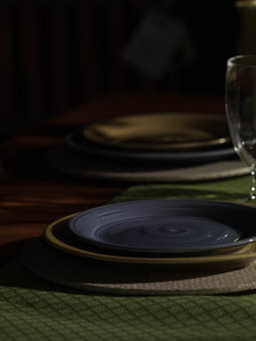
|
Great start, right? Pretty common. Just put the main light where you think it might end up, and take a picture. I’m usually close with the exposure, but it really doesn’t matter all that much, I’ll tweak it as we go along. (As a matter of fact, I don’t even know where my light meter is right now…) The first stem in a food photograph is to work out the composition. You can’t light until you know where most everything will end up. The first few exposures are all about refining the major elements of the photo. If you’re working from a layout (which I was) most of the elements are somewhat determined. For this particular project, we needed to leave room at the top and bottom of the image for copy (words). Some projects are more flexible than others when it comes to element placement. Luckily, this project tended toward the “flexible” side.
|
2 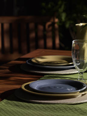
|
The Art Director had provided a sample image that he liked the “feel” of. We didn’t want to copy the image, but to produce something similar and to improve on it. The idea was to produce a set that looked as though it we shot out doors on someone’s picnic table. At this point, the Art Director, was a little scared, I think, (so was I :-) Notice how I tweaked the exposure up a little so we could all actually see what the heck we were getting.
|
3 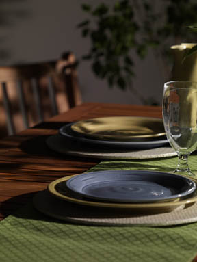
|
We thought that the chair was a little too dominat and would interfere with the copy, so we dropped the height of the chair. Actually, we had to raise the table and the camera. (Easier and cheaper than cutting off the legs of the chair) At this point, notice how I’ve added another light to the background. We can at least now see a little more of what’s going on. Also notice how the focus is “laid down” so that both plates are in focus.
|
4 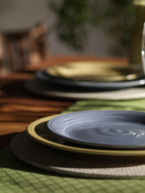
|
Seeing so much of the background scared me a little so I attempted to move-in a little closer to eliminate some of the background. I also changed my focus to make the background elements “softer." The front plate was the important one and I’ve found that using a minimum “depth of field” can help with the “mood” of the photo. I was able to change the focus, not with the aperture on the lens, but with the “lens plane” on my view camera. Surprised? Nice tool, right?
|
5 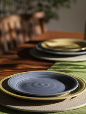
|
Well… The client wasn’t too impressed with me moving in tighter, so I had to “zoom out” a bit. I also moved a bit higher to see what that looked like. As you can see, this whole process is really a refinement process. Make a change, look at it, make another change. Notice how the plates have switched sides. Is that enough space down below for copy?
|
6 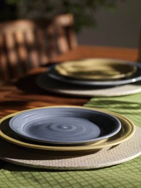
|
Hell no! Zoom out and pan down a little.
|
7 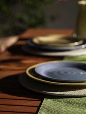
|
Who kicked the camera stand? Shui! I think we got a little carried away with shortening the chair here … What would happen if we changed the angle of the table and runner? Hated it!
|
8 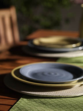
|
Now the damn chair is too high. Get out the saw… (just kidding)
|
9 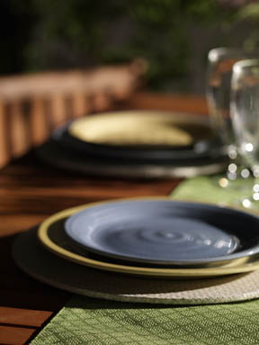
|
Chair feels a little better, but the angle still isn’t there. Who turned off the back light? We’ve been tweaking the tree a little from shot to shot. Have you notice that NOTHING is in focus? I’ll get to it, but for now, it’s not really an issue. We have other things to worry about.
|
10 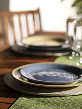
|
There’s the backlight! The seamless needs to be moved to the left, bit that’s a little better. Notice the nice highlight appearing on the front plate. One of the keys to becoming a better photographer is not only creating the shot, but recognizing “happy accidents” like those highlights, and using them to your advantage. Is the background a little too bright? Something’s not right. Still too artificial looking, but a heck of site better than that first shot! Where’s the tree go?
|
11 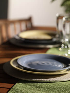
|
Well, I guess that the background wasn’t too bright last shot. It looked better than this… Does the table look a little bare? What can we add that you would find at a picnic?
|
12 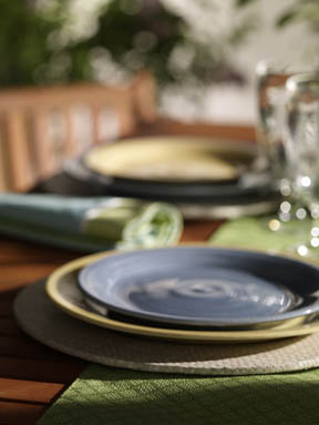
|
Wow! A little much with the tree. I like the colors of the napkin. Could work. Who has the hedge clippers?
|
13 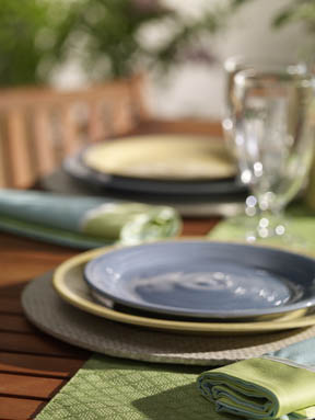
|
A little better with the tree, but still not there. Chair’s looking food though. There’s something about that background I just hate. Just doesn’t look real.
|
14 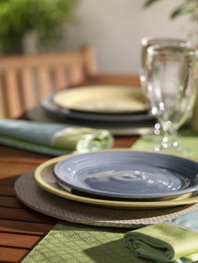
|
Here I tried changing the lights a little. I think I see a “dropped shadow” on the background. Naaa.
|
15 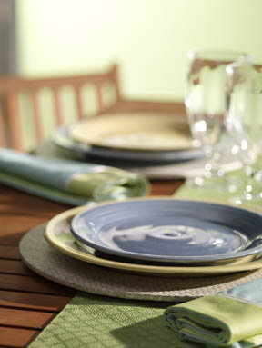
|
Maybe the problem is with the white background. Now too many white yards out there. Let’s try green. Better! We still need to move the background over though… Don’t forget!
|
16 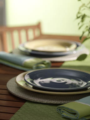
|
Maybe a plant, and not the trees…?
|
17 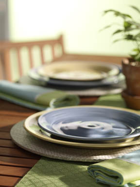
|
Move it in a little and add another stop of light to the background to “blow it out” a little… Maybe give the impression of looking (squinting) off the edge of the deck?
|
18 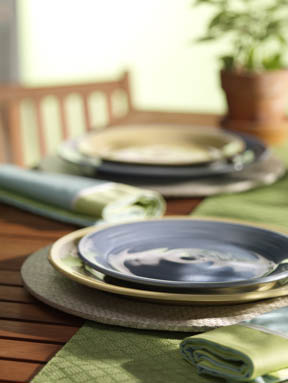
|
The plant is kind of a heavy hit (dark) there. Try back further. Is that background too light now? Tweak it and see.
|
19 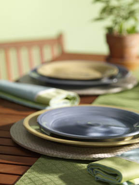
|
Naaa, I liked the background better, brighter. But at lease we moved it over so that it covers the entire back of the picture. Finally.
|
20 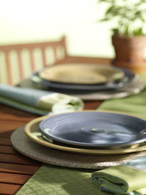
|
Background still seems too bright. Let’s get the trees back in there.
|
21 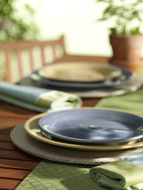
|
Now it’s starting to feel like something. |
22 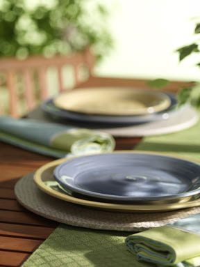
|
A little more tree. I keep looking at that pot in the back. Shouldn’t we be looking at the plate of food? |
23 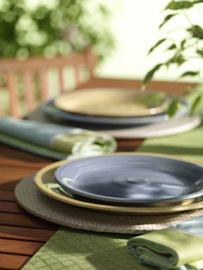
|
A little more tree, a little less plant. Does the plant look a little dark? What would happen if we added a little more light? |
24 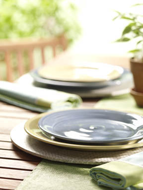
|
I said a LITTLE more light! Not Hiroshima. Still experimenting with that plant. Its about time to start tweaking the lighting. I’m pretty happy with the light direction. Many times, we get this far along and I realize that the light direction is all wrong. In this case, I think I got lucky from the beginning and choose the right direction. Notice how the light is “behind” the subject (plate). From experience, I’ve found that this is the only way to create good “shape." This is by far the biggest mistake amateur photographers make. Most newbes will place the main light somewhere in front of the subject. This tends to flatten out the photo. I’ve finally added a little more “fill light” to lighten the shadows. |
25 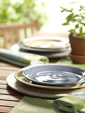
|
There is a very thin line between “blown out” and “just too damn bright." Finding that thin line is tough. |
26 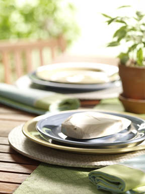
|
We’re almost there. In comes the stand-in chicken. Yes, I have wooden stand in chicken. There has to be something too light. |
27 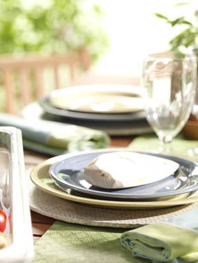
|
The glasses were added here and they sure helped. The object that you see in the front left is the food container arriving on set. |
28 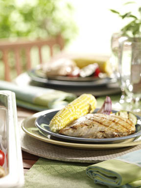
|
Finally, food. While we’ve been playing with the set, the food stylist has been preparing the food. This particular recipe isn’t a very “timing critical” one, like some can be. Throw the food down, ya gotta start somewhere! |
29 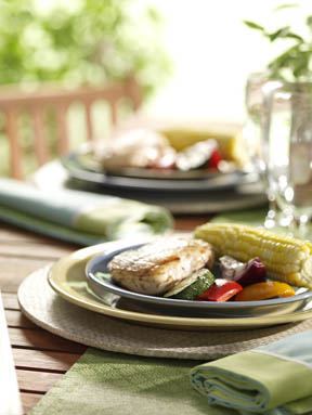
|
Notice in the last shot how “flat” the corn looked compared to this one. The relationship of the food to the light can make a huge difference in the end result. We’re really here selling chicken, so the veggies up front don’t make much sense. |
30 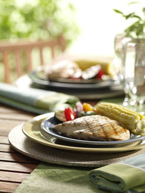
|
This looks like a good arrangement of the food. Good shape on everything. If the layout dictated the food arrangement, I would probably have to rearrange the lighting to best show off the food. In this case, we were able to arrange the food to match the optimum lighting for the original set. Notice all the beautiful reflections on the food and plates. Too many novice food photographers do their best to eliminate those reflections, thinking that all reflections are mistakes. Not so! Most reflections are their friend, they just don’t realize it yet. |
31 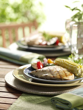
|
So what’s different here? (this is kind of like “where’s Waldo”) The garnish behind the corn. |
32 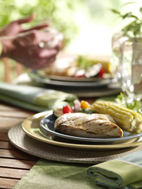
|
I have no idea what Ziggy’s doing here. Praying maybe? We added a little more tree to the top of the frame. |
33 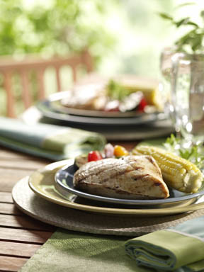
|
Are we seeing enough chicken? Try propping it up and or spinning it. A little more tree please. |
34 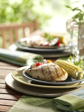
|
Naaa to both. Less is better sometimes |
35 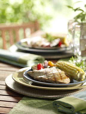
|
How about this angle on the breast? Not bad, but I think I liked it better the other way. |
36 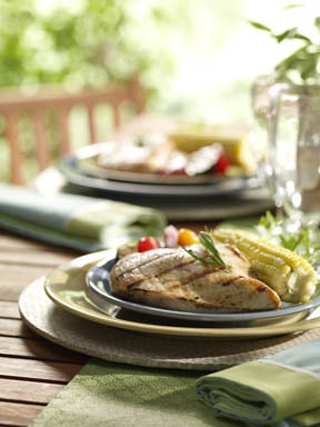
|
Agreed. Add so Garnish and tweak those veggies a little. |
37 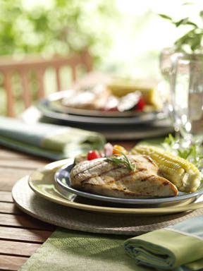
|
Slight tweak on the garnish. |
38 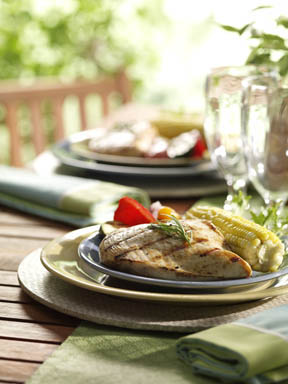
|
Slight tweak on the veggies. |
39 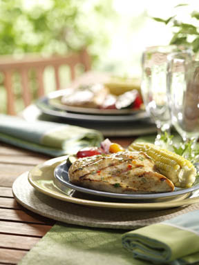
|
Tweak the veggies and add the sauce to the chicken. It’s almost “Miller Time." |
40 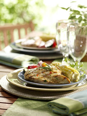
|
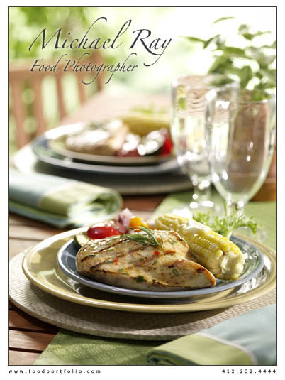
Put the garnish back on, add the slab of butter, torch it, shoot it and lets DRINK!
So, I hope you found this interesting and worth your time. Check back again to see if I can come up with anything else of interest. |